
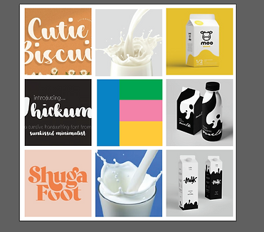
Mood board: This mood board explores visual references for the brand's tone — playful, fresh, and slightly nostalgic. It helped define the type of style and energy I wanted to carry through in the branding.
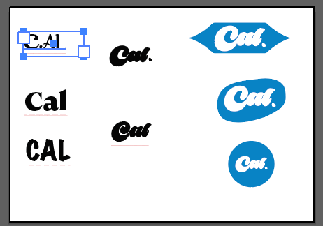
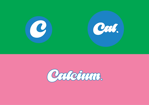
Logo Concept : Here are early logo explorations aimed at capturing a sense of friendliness and playfulness. I tested a range of type styles before refining a custom Wordmark that could carry the brand’s personality across different formats.

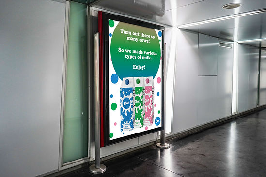
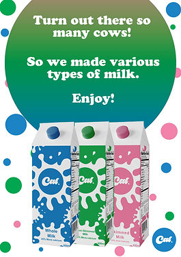
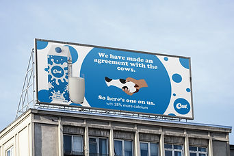
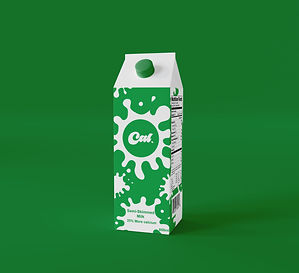
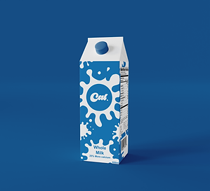
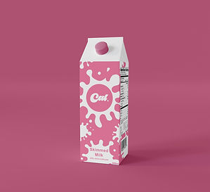
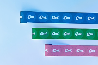
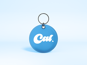
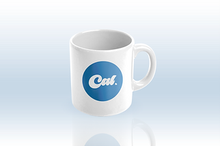
Brand elements: This stage focuses on how graphic elements could extend the brand — using shape, color, and repetition to create visual consistency. I explored applications across packaging and patterns, ensuring the brand would feel cohesive and recognisable in real-world settings.



CAL
Concept:
Cal is a fictional milk brand created as part of a self-initiated exploration into nostalgic food branding. The goal was to craft a logo and visual language that felt playful and comforting, while staying clean and modern — something you’d expect to see on a boutique organic milk carton or retro-styled café fridge.
Challenge:
The challenge here was to balance a vintage charm with a modern aesthetic, without leaning too far into kitsch or minimalism. I wanted the identity to evoke warmth and personality, but also feel contemporary enough to work on real-world packaging.
Process:
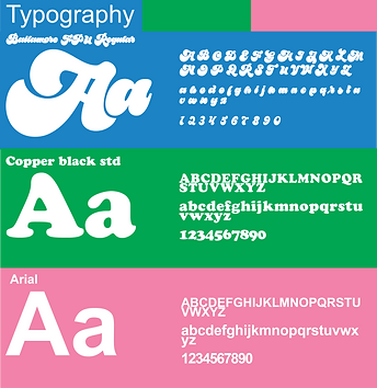
I began with a mood board combining hand-drawn script typography, milk splash photography, and soft, organic packaging references. From there, I experimented with a variety of font treatments and wordmark directions — ranging from serif type to custom rounded lettering. Once I landed on a bold, brush-style script for “Cal.,” I explored multiple lockups and container shapes to create a visual system, including circular, stretched, and irregular badge forms suitable for print, packaging, and stickers.
Outcome:
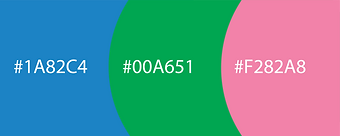
The final design system features a friendly, eye-catching logo and a set of simple, adaptable brand marks. Paired with a soft blue palette and generous white space, the identity feels both nostalgic and fresh. It serves as a proof of concept for playful, personality-driven food branding.