

Scape
This fictional brand was created to explore the complete branding journey — from strategy and naming to visual execution. It shows my capability to build brands independently with a clear design system that alter brand visuals and identy.
This brand (Scape) a fictional brand which is based on cloud gaming site that is conveying a theme of energy, excitement, enjoyment, and immaturities to a certain degree that also appeal to adult. This is denoted by the quadrant of which are brand elements and take on various colours that consist of green and yellow, these colours that exist with the orange are declaring a scents of enjoyment and excitement. This was to portray the feeling that one will feel when interacting with scape.
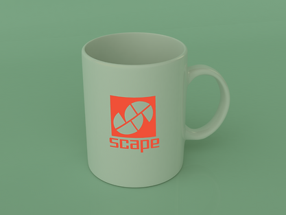
The logo is to depict what scape relate to that being landscaped, moonscape and sky scape. With the quadrant that create a capital S, these are thing that are used to describe objects that would be on such scape. And the square that denotes a scape. The fonts for the brand is futuristic, as it can conform to games that would be played on gaming systems. It also show that this is advanced technology which is usually associated with in films and TV serious as futuristic.